I am a recent graduate of Billy Blue College of Design (Torrens University) with a Bachelor of Interior Design (Commercial) and am looking for the opportunity to express my creativity but also challenge and improve my skills. I hope to continue to learn and contribute to the design industry.
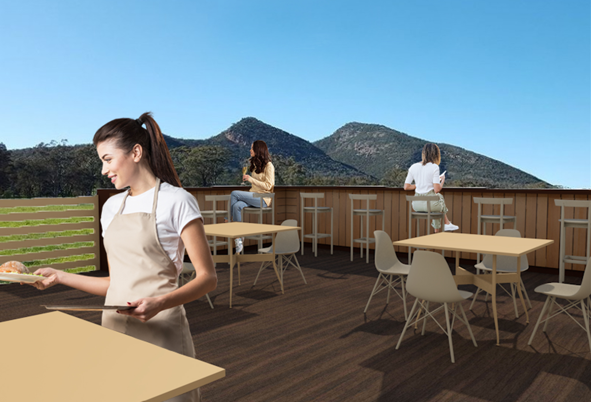
The concept is to connect customers to the rhythm of seasons and to reflect Barossa Valley in the design. This is shown through incorporating branding such as Maggie Beer’s logo with the symbolism of the bird and the Arabic Typesetting for the name. The branding colours pantone which is great for wall and/or furniture finishes and black which is great for definition.
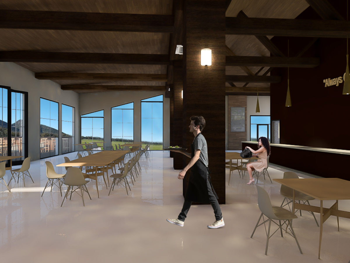
This is also shown through the architectural point of the building, using the ridge board at high point, and exposing the roof to give definition of internal architecture. There will be a large entry to create a welcoming sensation and large scaled windows that will also give in natural lighting plus a bonus view of the scenery.
Materials were kept to a neutral brown tone that tied in the branding colour palette with colours such as pantone and black which are the brands initial colours and adding on colours such as beige and a cream white that adds on character to the space. For the main and outdoor dining areas I used Herman Miller’s Eames fiberglass chair and their Nelson swag leg table.
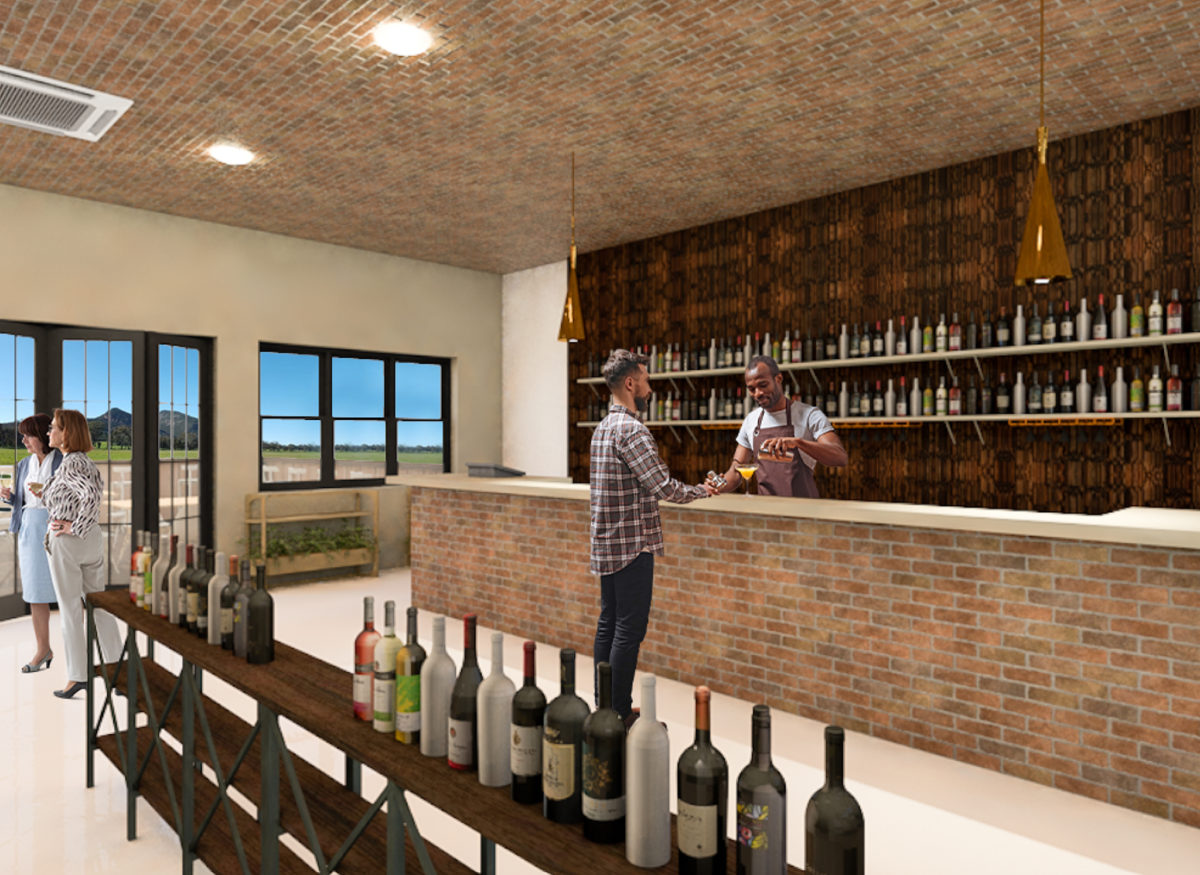
For the outdoor seating, Beaumont’s elegance timber for the edges of the bar seating and Herman Miller’s comma stool. Moving on to the winery and shop area, I shifted the focus to the bar area where I used Beaumont’s Tribeca old red brick textured to add character to the space and Kulture panelling that adds definition to the space with the defined black streaks. Zenith designs and produces these Archie Tables with different set heights and diameters which worked out perfectly with adding character to the space. To top it off, I placed Tom Dixon’s gold, beat LED tall pendant directly above the bar in the winery and above the dry bar in the main dining area.
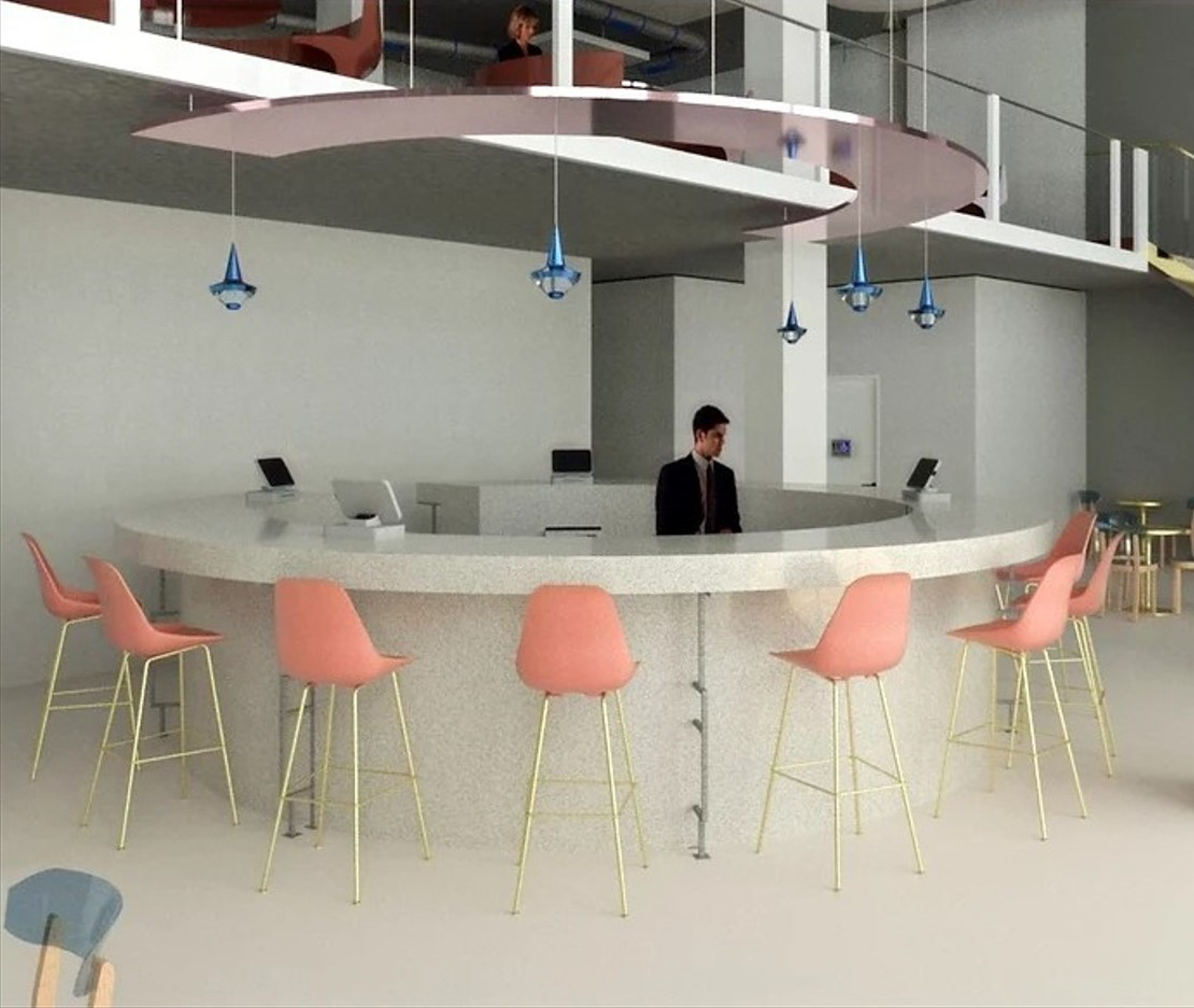
Located between Sydney’s CBD, Parramatta’s CBD, and Macquarie Park. Wentworth Point is part of a carefully considered residential plan for a unique urban area located adjacent to a rapidly growing commercial and retail hub. The café is located within an existing building and occupies a waterfront position.
The land was once consigned to factories and warehouses and has been converted into apartment complexes. The ground floor commercial space in the Bellagio residential apartment development is currently untenanted.
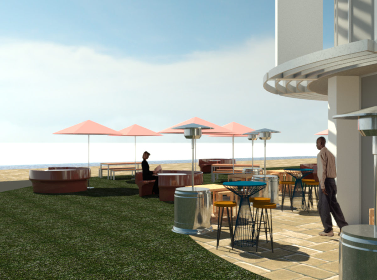
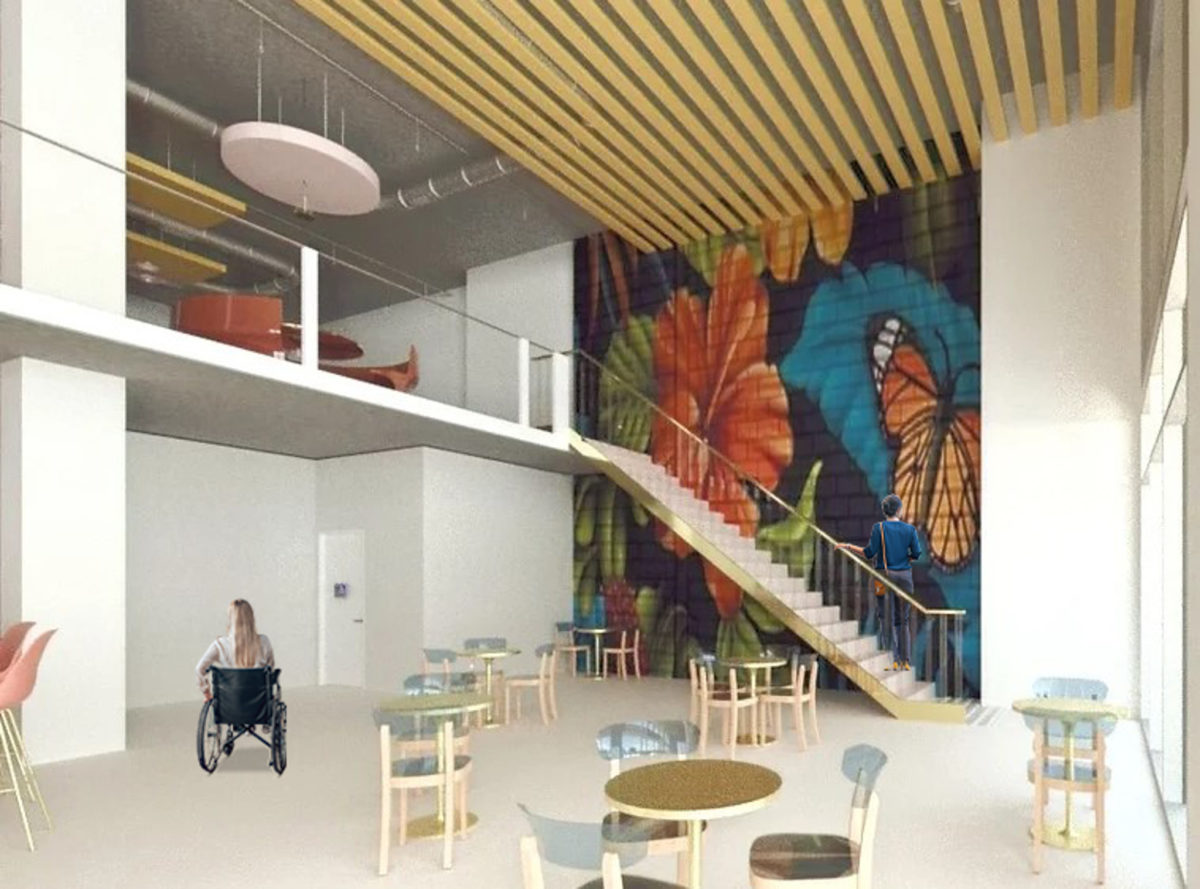
The concept behind my design is to create an atmosphere that is relaxed and playful, with a strong sense of a growing community. I incorporated design opportunities such as park and nature reserves and waterfront views through large-scaled windows and maximised ceiling heights.
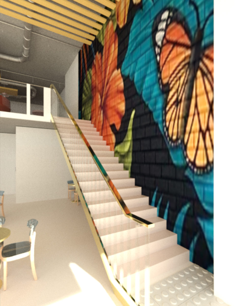
In addition, the furniture has been designed and crafted specifically for this project. I have incorporated a circular bar with a reflective rose gold drop ceiling with matching circular private booths and a mezzanine where locals and visitors can unwind. The custom-made round tables by Kartell and an outdoor bike rack and repair shop all aim to entice locals, families, and young professionals to this venue. Bright pops of colour and natural light, carefully considered material textures along with contemporary, local graffiti art, result in the development of an inviting, practical space that reflects the requirements of the clients.
