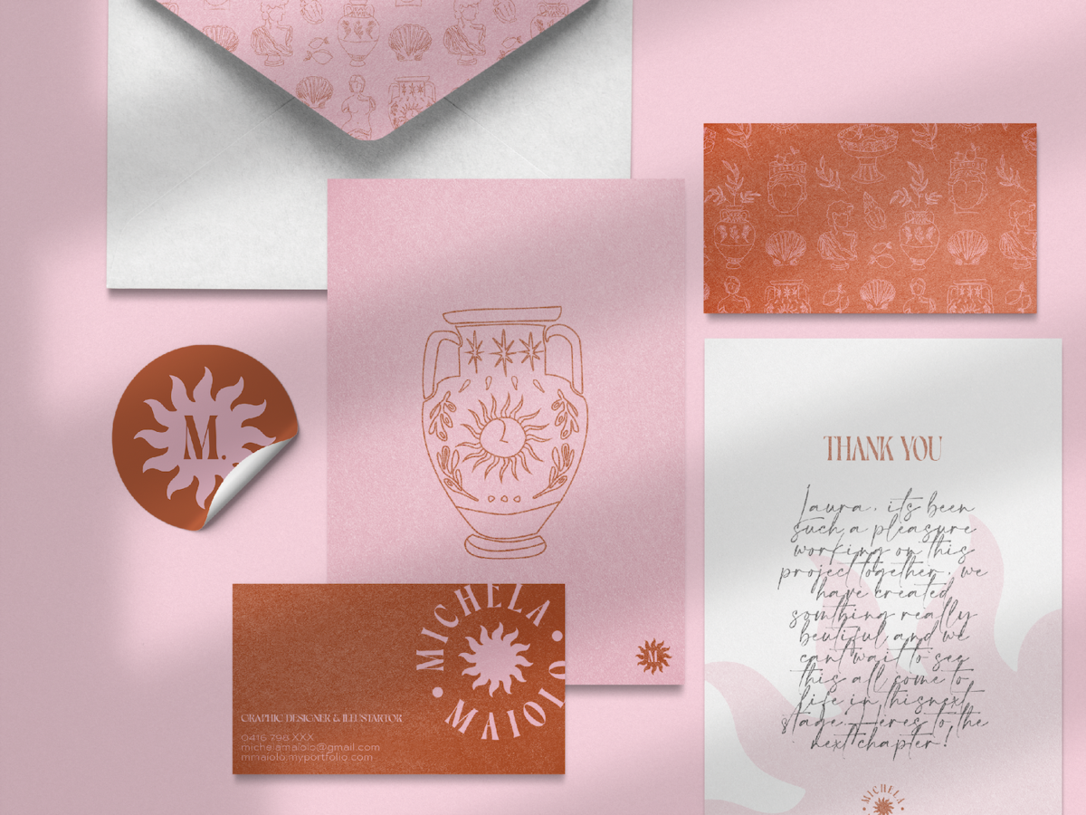
I’m Michela, a Graphic Designer and Illustrator based in Sydney, Australia. My background of interior design, homeware retail and food manufacturing, helped me discover a passion of design and illustration. My creative and open-minded approach to design is inspired by nature, travel, and the world at large.
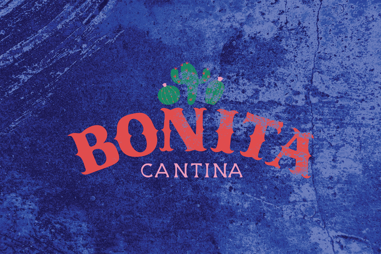
To create a brand new identity for a new chain of casual eat in/take-away restaurants opening in Australia serving a cuisine of our choice. The chain was to target an audience who loves to experience new food which is fast and moderately priced. The brief required a set of themed illustrations along with a logo incorporating illustrative elements and a custom hand-illustrated typeface - no existing digital typefaces were to be used in the logo. The branding created was to be used across all the brands collateral.
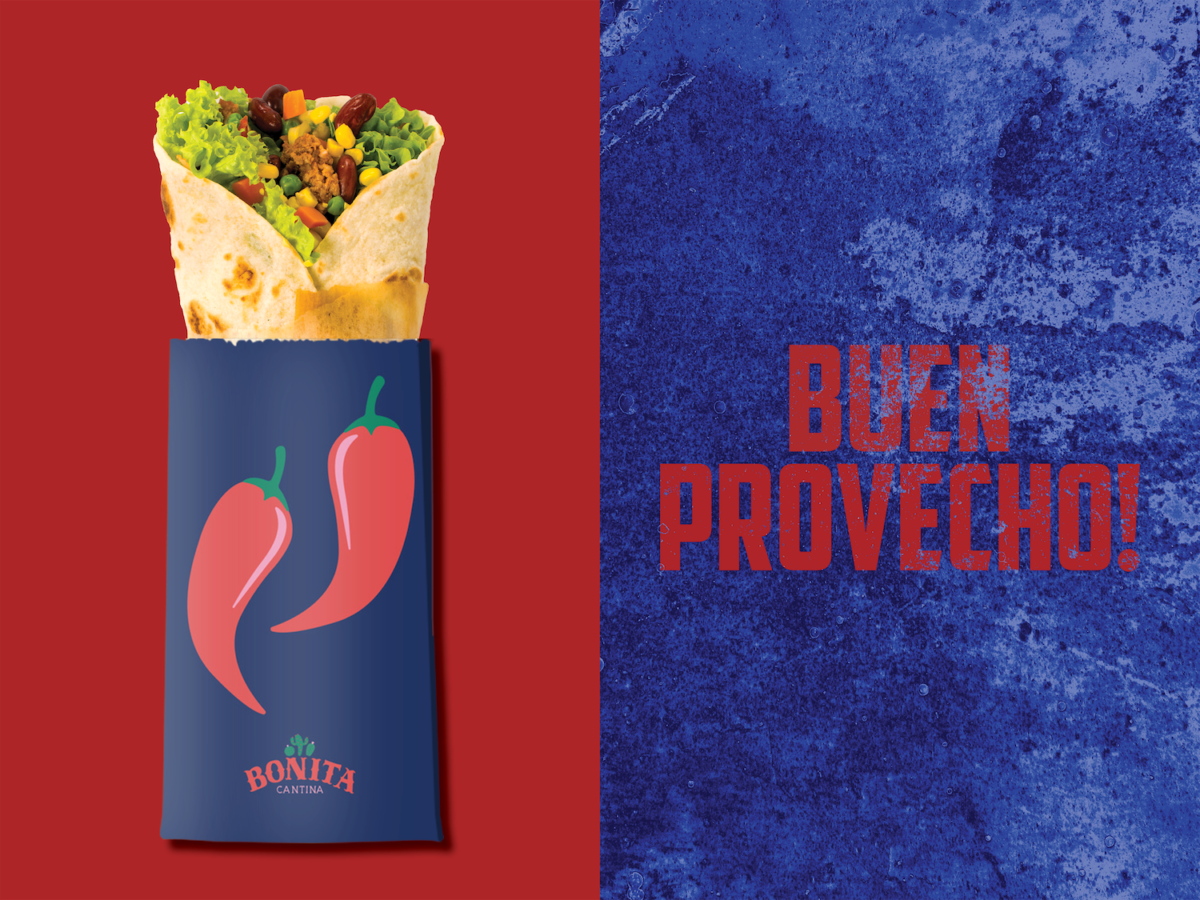
Bonita is a lively Mexican beachside cantina which offers casual eat-in dining, and a full takeaway menu. I used a bright colour pallet in my illustrations and logo to express the vibrant personality of the restaurant while honouring the authenticity of the food served, featuring fresh ingredients. The modern vector style of the illustrations appeals to the younger target audience and lends itself to the causal nature of the restaurant. The logo featured hand-illustrated type which suits the cuisine and Mexican culture and compliments the illustrations.


The brief was to create a personal identity and brand which not only reflected our design style but also our personality. The brand created was to be applied to our portfolio both printed, online and any other self-promotional material.
By highlighting what inspires and motivates me, I designed a brand to promote my work to potential clients and employers that would communicate my values and design process. While my initial inclination was to stick to neutrals and take a more minimalistic approach I realised colour, nature, and detail is much more ‘me’ and I wanted to express this in my brand.
