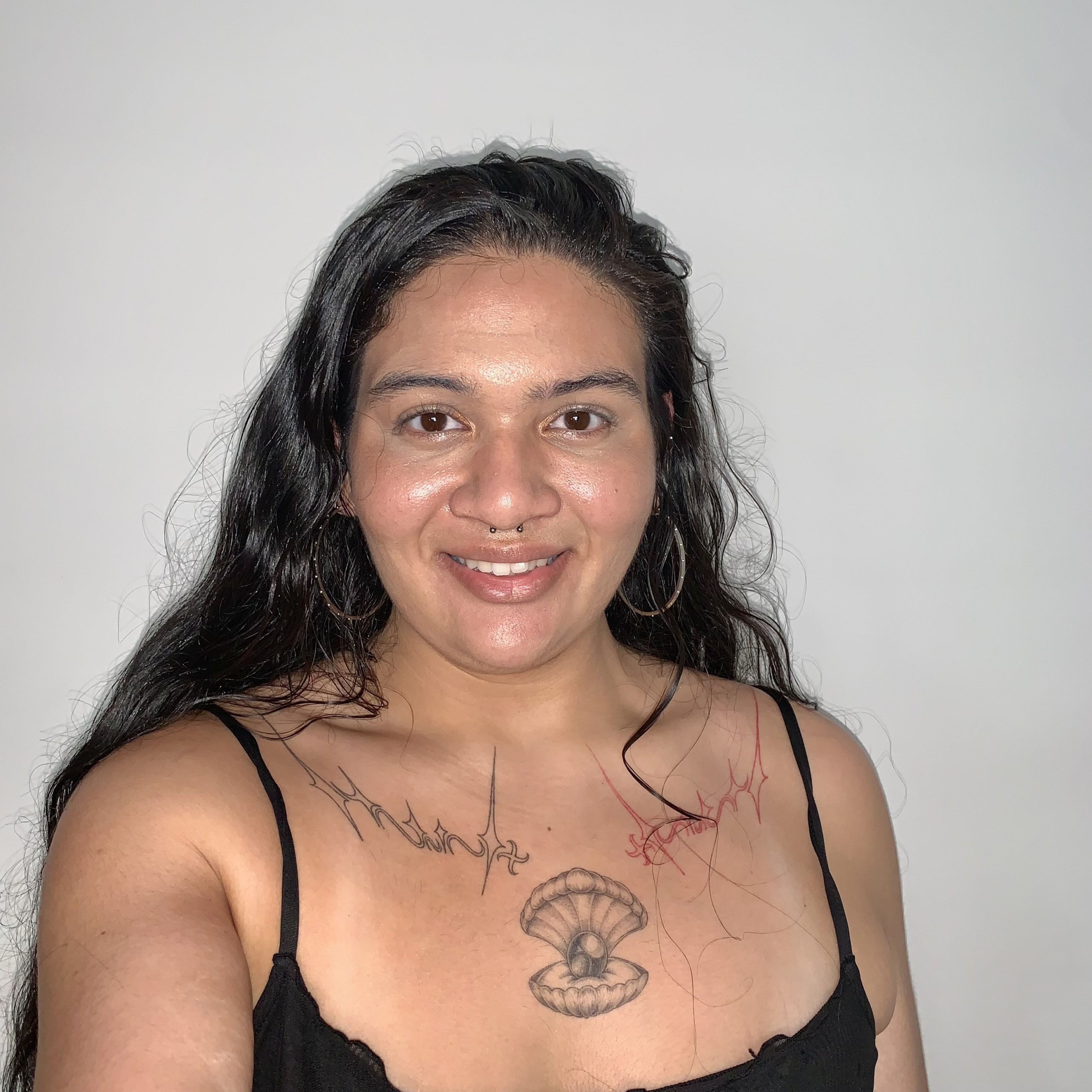
Hi, I’m Iz, an empath creative driven by people, places, and causes. I trust in honesty to connect us. I idealise a future where we care more for the community, environment, and progress. My design practice goes beyond me. I wish for my small mark to create ripples into a better future.
Brief:
Discover tangible solutions to promote films made by women.
Client:
Screen Australia is a federal agency charged with supporting Australian screen development, production, and promotion. They have an umbrella initiative called gender matters. This initiative is screen Australia’s effort to address the underutilisation of female talent in key creative roles within the Australian screen industry.
Design rationale:
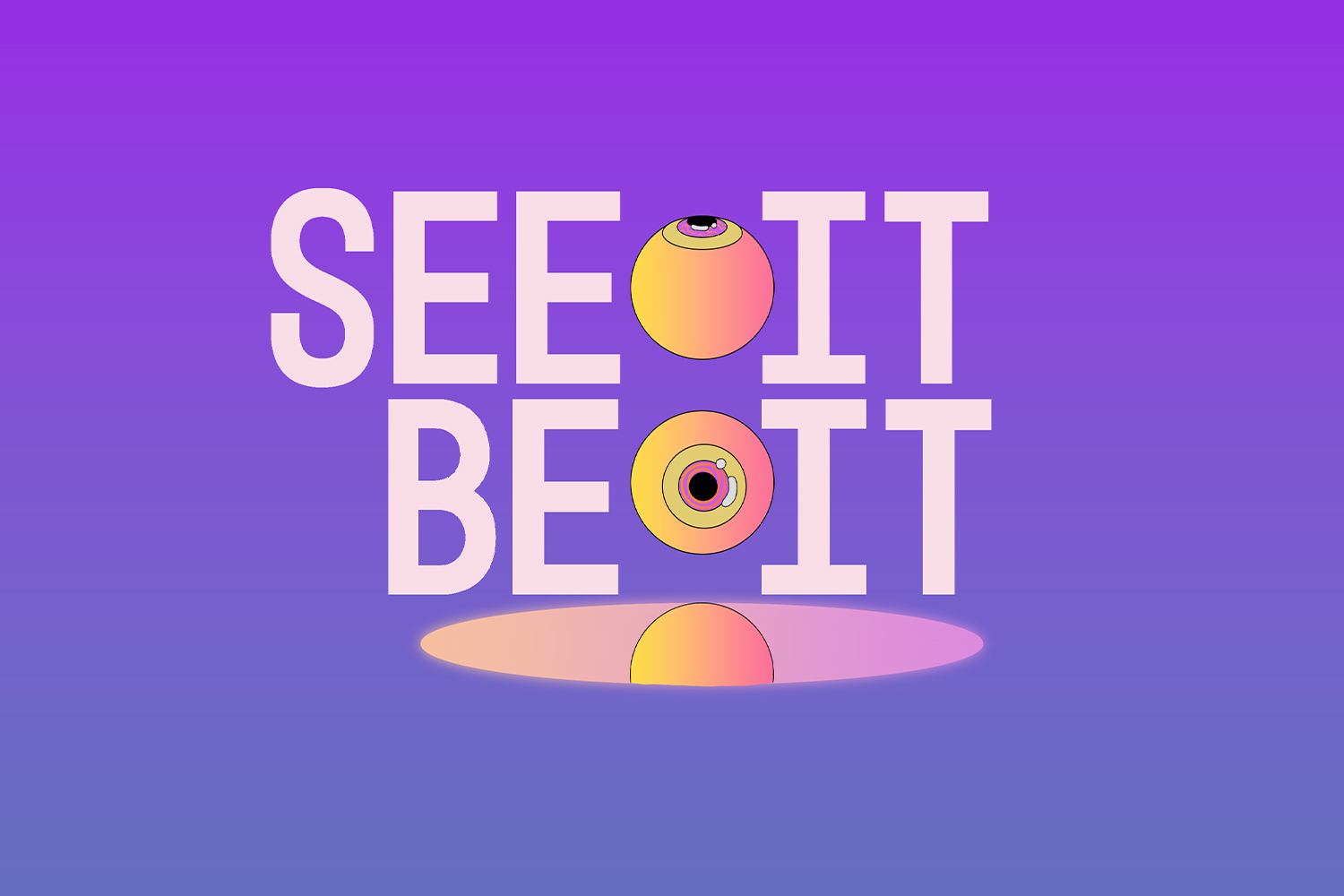
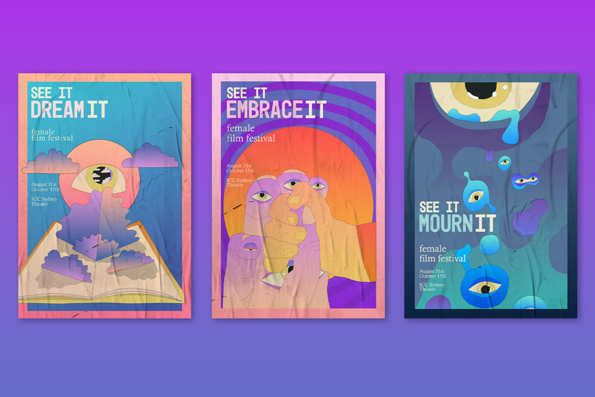
The see it be it female film festival is an opportunity to see unique female experiences on screen. Influenced by the idea of discovering new worlds in film, I utilize psychedelic graphics. Diversifying the film industry creates new content for audiences to explore. We love films because of the different realities they build for us. Each film poster is its own world. The project has a flexible color scheme that is interchangeable depending on the narrative it symbolizes. Contrasting contemporary perspectives is the use of familiar written language. Words that are emotions or circumstances are one that anyone can connect with. We can also witness different narratives and find empathy.


Brief:
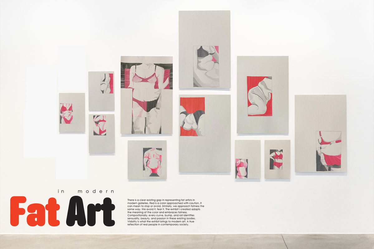
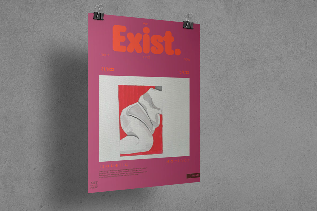
Presenting my existing art in a way that a gallery would present a new exhibition.
Client:
Fat in modern art is a self-initiated project. In a way, I become the client. Beyond my personal passions as an artist, the audience also plays a vital role in art. My work represents the fat community. It’s for every young girl to see a part of themselves through it. They are also the client. Finally, the project encourages the possibility of presenting fatness in art. It motivates the NSW galleries that present close to 0 pieces on fatness.
Design rationale:
works/exhibitions on fatness
MCA= 0 work
Art Gallery NSW= 7 works
National Gallery of Victoria= 5 works
white rabbit= 0 work
There is a clear existing gap in representing fat artists in modern galleries. Red is a colour approached with caution. It can mean to stop or avoid. Similarly, we approach fatness the same way. We avoid it, fear it. The exhibit I created adapts the meaning of the colour and embraces fatness. Compositionally, every curve, bump, and roll identifies sensuality, beauty, and passion in these existing bodies. Visibility is what the exhibit brings to modern art. A true reflection of real people in contemporary society.

