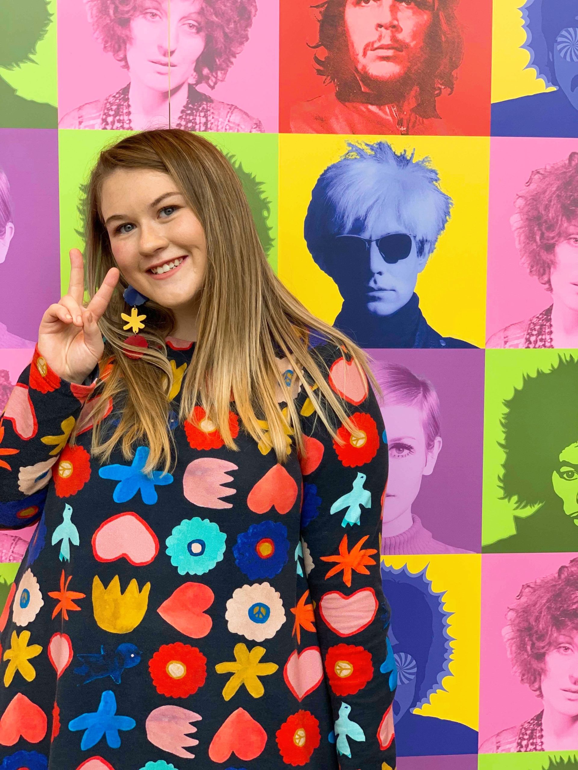
Hi! I’m Lauren and I’m a Pastry Chef turned Graphic Designer based in Melbourne.
I am a passionate, determined and colourful creative that is constantly amazed by the wonderful world of design. I am a creative problem solver who is always up for a challenge in bringing projects to life that engages, excites and inspires. I have a special interest in print and packaging design as I have a love for paper, textures and embellishments. I'm excited to be a part of this amazing and creative industry and cannot wait to embark on my career path as a Graphic Designer.

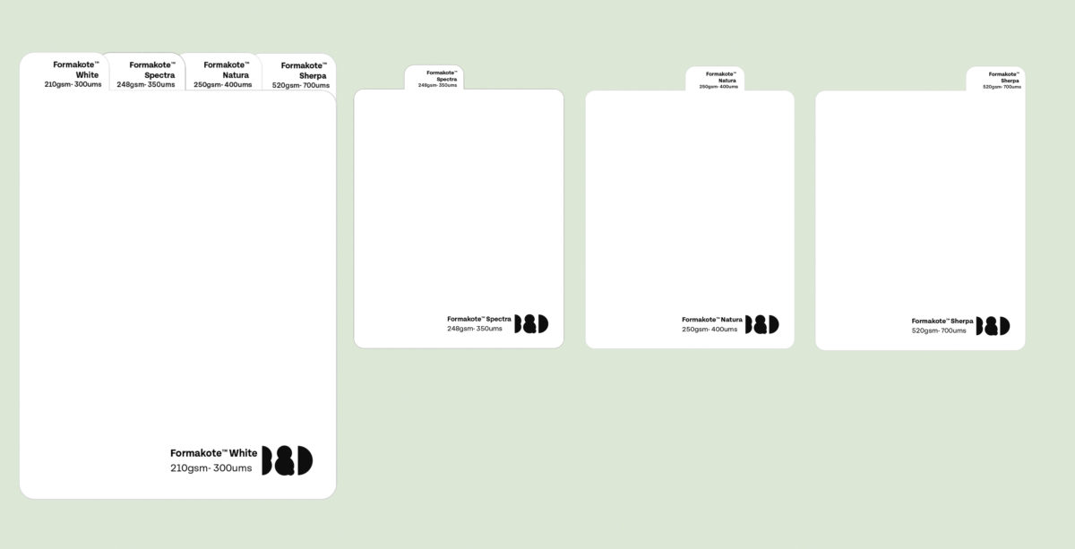
Ball & Doggett aimed to create a sustainable sample pack for their new paper stock range, Formakote. This sample pack has a tabbed card system inside that organises the four different stocks and their gsm/ums, with complimentary illustrations for the different stocks. The brief was to promote sustainability and appeal to Ball and Doggett’s large and diverse target audience with a flexible tone of voice.
To keep this design as sustainable as possible, I opted for a blind emboss on the front outer of the packaging, which still gives the design the use of an embellishment to make it pop. I also used interlocking for the packaging that meant it didn't require the use of glue to hold the packaging together.
The illustrations on the tabbed cards represent the types of products/food/beverages that a certain stock could be useful for;
Formakote Sherpa has illustrations of a bottle and a can that represents the toughness, durability and wet strength of this paper stock.
Formakote Natura has a chocolate illustration to show that it's perfect for everyday packaging.
Formakote White has a burger illustration that is to represent how this paper stock is perfect for quick service restaurants and grease resistance.
Formakote Spectra has doughnut illustrations to show the strength/stiffness of this paper stock, which could be useful for a box of doughnuts.


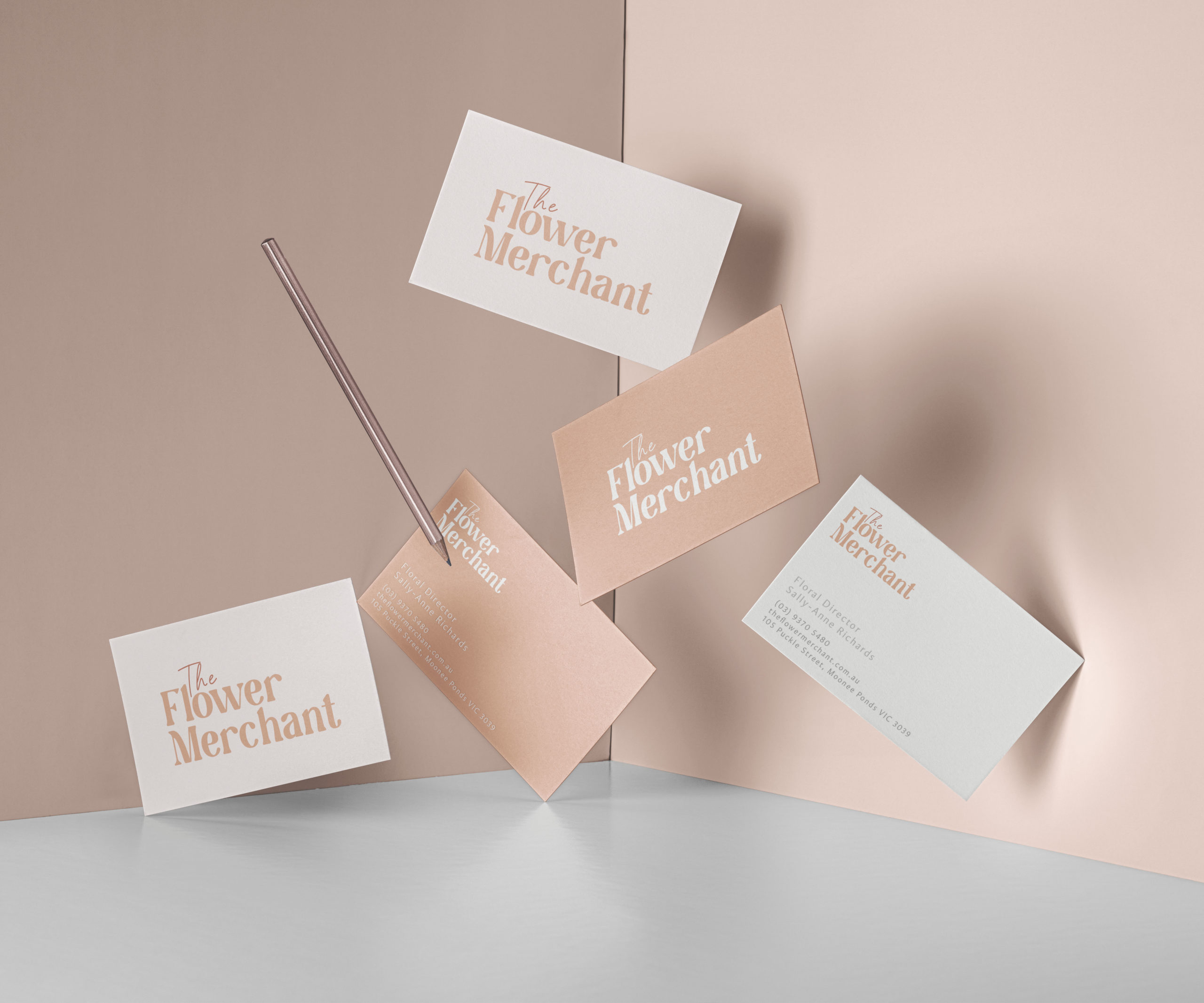
The objective of this project was to create a new logo and brand identity for an existing local business.
The Flower Merchant is a Melbourne florist that creates beautiful arrangements consisting of fresh and locally sourced flowers. The business has a very homey and friendly personality, giving customers a relaxed and comfortable experience when they shop in their store.
I aimed to give The Flower Merchant a fresh coat of paint with a distinct branding that is exciting, memorable and well suited to the business.


